Villa Sapphire

Every time I enter an office lobby or shopping mall, I can't help but notice the small details that make up the space. This is mainly because I took Interior Design during my high school years, and my interest grew in the field since then. During 10th grade, I took the opportunity to compete in a region-wide Interior Design competition, where we were given the task of designing a "mini home" for a potential client. In this design project, I experimented with a variety of textiles, fabrics, flooring types, and furnishings to design the perfect home for my client.
Duration
January 2020 - February 2020
Roles
-
Composed client background.
-
Designed layout, color scheme, floor plan, elevation sketch, and furniture for a 500 sqft home based on client background, needs, and preferences.
-
Contacted flooring and textile companies to create the most optimal design.
-
Prepared a file folder, an oral presentation, and visuals to demonstrate knowledge and diligent planning.
Skills
-
Thoughtful interior designing
-
Broad ideation
-
Effective decision-making
-
Innovative storytelling
Design Challenge
Design a room to meet the living space needs of clients based on the current state themes. In advance, create a floor plan, elevations, and a furniture/interior plan addressing the specifics of the design theme.
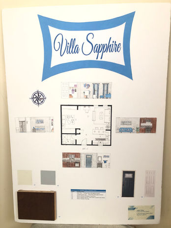
Studio Floor Plan
The studio apartment follows an open floor plan. The kitchen, bathroom, and a coat closet are located at the entrance of the studio. Julie's bedroom area and desk area, as well as the living area are located at the back of the studio.

Letter | Area |
|---|---|
A | Entrance |
B | Bathroom |
C | Bedroom Area |
D | Living Room Area |
E | Kitchen |
1/4 " = 1'
Client Overview
Julie Albertson is 23 years old and is a recent college graduate. She is originally from the Bay Area but moved to Southern California because she found a job there. She is working full-time as a Marketing Manager at Danaher Corporation in Anaheim. Julie doesn’t like driving far distances, so she found a studio apartment just 15 minutes from her work in Anaheim. Julie works from 9 AM-5 PM everyday and usually visits her family in San Francisco on the long weekends and breaks. Because she isn’t usually at home during the daytime, Julie really only needs the basic essentials for her studio. Julie loves geometric and floral designs and cool colors including blue, light gray, and white. She also loves plants and smelling their fresh scent. She wishes for these elements to be incorporated in her studio. Julie also prefers minimalistic and modern design.
Studio Elevation Sketches
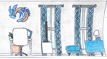
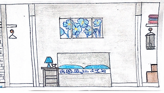
The color scheme that was selected for the studio was shades of blue, white, and gray. Along with these colors, geometric and floral designs, and plants were also incorporated in the design of the studio's interiors.
Kitchen, Entrance, & Bathroom
Bedroom & Living Room


Bathroom & Bedroom

Living Room & Kitchen
Kitchen


Decorating Plan
Theme
Modern, Minimal
Color Scheme
Silver, Bronze, Espresso
Activities
Cooking, Eating, Washing Hands and Dishes
Backgrounds

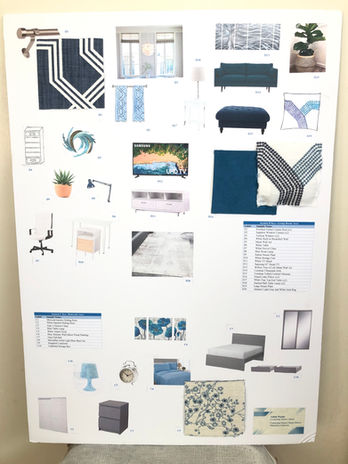
Furnishing Plan
Furniture
Accessories and Decorations


Living Room


Decorating Plan
Theme
Modern, Minimal
Color Scheme
Blue, White, Light Gray
Activities
Working, Watching TV, Lounging/Relaxing, etc.
Backgrounds


Furnishing Plan
Furniture


Accessories and Decorations


Bedroom


Decorating Plan
Theme
Modern, Minimal
Color Scheme
Dark Gray, Blue, White
Activities
Sleeping, Relaxing, etc.
Backgrounds


Furnishing Plan
Furniture


Accessories and Decorations


Bathroom


Decorating Plan
Theme
Modern, Minimal
Color Scheme
Grays, Silver, Blues
Activities
Using Bathroom, Taking Shower, etc.
Backgrounds

Furnishing Plan
Furniture

Accessories and Decorations

Principles and Elements of Design
Line
Horizontal lines are incorporated throughout the living space. Furnishings that have horizontal lines in Villa Sapphire include: the bed, TV, TV stand, ottoman, sofa, wall art, and wall tiles (in both the kitchen and shower). The horizontal lines used throughout the studio provide balance, symmetry, and harmony. Additionally, the doors, closets, island stools, end tables, bookshelf, island, table desk, windows, curtains, nightstand, and under-desk storage unit are vertical lines seen around the home. These vertical lines add height, harmony, and space to the living space.
Space
Edit this paragraph to highlight a specific service or feature you offer. Click "Edit Text" to begin editing the content and make it your own.
Space
Edit this paragraph to highlight a specific service or feature you offer. Click "Edit Text" to begin editing the content and make it your own.
Space
Edit this paragraph to highlight a specific service or feature you offer. Click "Edit Text" to begin editing the content and make it your own.
Balance
-
Achieved a balanced color palette with blue, light gray, and white.
-
Maintained balance between patterns and solids in furnishings.
-
Used a blue color scheme in the living room for a welcoming atmosphere.
-
Balanced colors with neutral furnishings.
-
Coordinated curtains with sofa cushions for symmetry.
-
Repeated floral theme in wall art to establish equilibrium.
Line
-
The living space includes horizontal lines in various furnishings for balance and harmony (such as the bed, TV, TV stand, ottoman, sofa, wall art, and wall tiles in the kitchen and shower).
-
The studio also incorporates vertical lines in doors, windows, and other elements for added height and space (such as the doors, closets, island stools, end tables, bookshelf, island, table desk, windows, curtains, nightstand, and under-desk storage unit).
Color
-
The client's preference for cool colors like blue, light gray, and white influenced the studio's color scheme.
-
Blue tones create a welcoming and calming atmosphere, with vibrant blues in the living room for an awakening feel and softer blues in the bedroom for relaxation.
-
Neutral colors complement and balance the blues, adding to the harmonious ambiance.
Emphasis
-
The sofa and ottoman, with their vibrant blue color, serve as central pieces in Villa Sapphire's design.
-
The surrounding neutrals highlight the welcoming and attention-grabbing quality of the blue furnishings.
-
In the kitchen and bathroom, the bold and lively wall tiling takes center stage.
Variety and Unity
-
Variety and unity is incorporated by using different shades of blue and neutrals in white and gray.
-
The living room area features bold and vibrant blues, while the bedroom area opts for softer blues.
-
Consistency in the color scheme establishes unity throughout the home.
Texture
-
The sofa fabric, Ultrasuede, is a comfortable material made of polyester and polyurethane.
-
The 100% cotton comforter is a warm and cozy choice that complements the color scheme.
Harmony
-
Harmony is achieved with the calm shades of blues, whites, and grays that are applied to the space.
-
Creates a sense of serenity, peace, and harmony for the client.
Rhythm
-
Matching patterns in curtains and pillows, along with similar designs for the comforter and bedroom wall art, create rhythm.
-
Repeated colors and tones throughout the home add harmony, symmetry, and rhythm, promoting feelings of peace and relaxation.
Space
-
Efficient use of a small 500 sq ft studio with essential, multi-functional furniture.
-
Some multi-functional furniture pieces include the kitchen island, undercounter refrigerator drawer, underbed storage drawers, etc.
Proportion and Scale
-
Ottoman is centrally placed, offering easy access from the sofa, and also carefully matching sofa's shape.
-
Kitchen features three evenly spaced pendant lights for balanced lighting.
-
Proportion and scale considerations create a sense of balance and harmony for the client and guests.
Functionality
Careful thought and consideration was took into account for the studio's design to achieve maximum functionalaity and accessibility, to ensure an enjoyable experience for the client in their living space. As a result, the furnishings selected for the space are multi-functional, making them more efficient and also space-saving.
Kitchen
The kitchen island could be used as either a counter, table, or workplace. The pendant lights placed above the island add functionality as well as style to the kitchen area. Additionally, there is a double drawer refrigerator placed beneath the island so a full-sized fridge wouldn’t take up space. Also, the microwave is located above the stove for the same purpose— to save space, but still make the appliance accessible and the area practical and functional.
Living Room
The end tables in the living room offer a hinged tabletop as well as a bottom shelf, providing both concealed as well as visible storage. Besides the storage they offer, the top surface of these tables allow individuals to place both essential and decorative items, such as a lamp. The ottoman, too, is multi-functional. It could either be used as a temporary center table and could also be used to sit or rest one’s legs on.
Bedroom
The storage unit that is placed under the table desk allows the client to store any of her office or personal materials there. This is very useful as this storage unit can help her stay organized and productive. Instead of just keeping the wall to the left of the desk bare, the built-in bookshelf was designed as extra storage for books as well as where decorative items could be displayed. Finally, the underbed storage drawers take advantage of the limited square footage. Two drawers, the same color as the bed, can be rolled out from the right side of the bed. By making use of the empty space between the bottom of the bed and the floor, no extra space is occupied for storage, making the design of the home highly functional, organized, systematic, and realistic.
Environmental-Friendly Choices
Sofa Material: Plant-Based Polyester Microfiber
-
15% plant based content
-
GREENGUARD certified
-
Reduces indoor air pollution
-
Less risk of chemical exposure
-
Healthier indoor environments
-
Meet chemical emission limits

Toilet
-
Uses only 1 gallon of water per flush
-
Conserves water
-
About 45% water savings

Visuals
Business Card

-
Neutral (white) background
-
Blue, geometric design
-
Neutral blue font


